Business Context & Goals
Health insurance members expected mobile experiences comparable to banking and retail apps, but Healthx only offered responsive web that lacked native capabilities like offline access and push notifications. This created competitive disadvantage and client retention risk across 80+ health plans.
- Responsive web couldn't compete with major payers' native apps
- No offline access to critical health information during appointments
- Increased support calls due to mobile friction and slow loading
- Sales teams losing deals to competitors with superior mobile offerings
The Challenge
I designed for health insurance members who needed quick access to ID cards during healthcare encounters, healthcare providers requiring patient verification, and health plan administrators monitoring engagement.
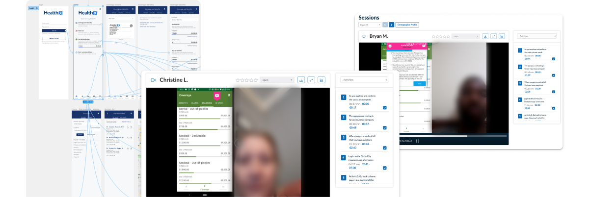
Through user research, I found that members struggled with our slow web-based mobile experience lacking native features like offline access, especially during time-critical healthcare situations requiring immediate ID card access.

What We Learned
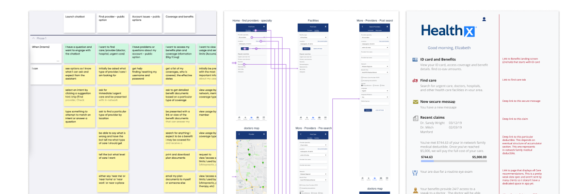
I conducted detailed competitive analysis of 15+ major insurance mobile apps, analyzed mobile web usage patterns across 80+ client portals, and led member interviews across demographics.
- 70% of mobile sessions involved ID card access
- Core usage focused on three tasks: ID cards, provider search, claims tracking
- Native capabilities like offline access were essential differentiators
Our Approach
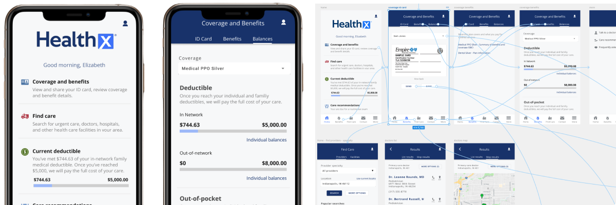
We developed native mobile apps with mobile-first information architecture, focusing on core member tasks while implementing white-label theming and push notification systems.
- Instant access to critical healthcare information through offline functionality
- Location-aware services for provider search and appointment booking
- Transparent information architecture reducing cognitive load

The Design Journey
I led systematic design phases through competitive analysis, information architecture redesign, high-fidelity prototyping for iOS and Android, and user testing with task-based scenarios.
- With Product Teams: User research influenced MVP feature prioritization
- With Engineering: Platform-specific requirements shaped technical architecture
- With Sales Teams: Competitive analysis improved client positioning strategies
Impact & Results
- 45% increase in mobile engagement through improved session duration and feature usage
- 30% reduction in support calls for basic information requests via enhanced self-service
- 80+ branded mobile apps deployed across health plan clients, strengthening competitive position
- 50% faster task completion for core activities like ID card access and provider search
Offline functionality became critical differentiator not just for rural connectivity, but for urban healthcare facilities with WiFi restrictions, enabling reliable access during medical encounters when members needed it most.
- Healthcare context demands reliability over features - users need guaranteed access to critical information
- Platform-specific design patterns improved usability scores by 35% compared to generic approaches
- Competitive research drives prioritization - deep analysis identified underserved user needs in insurance mobile space